How to Use Analytics Tools to Improve Your App User Experience
There’s a reason why we talk so much about the importance of having a data-first approach when it comes to effective app marketing strategies. You’ve probably heard the stats: there are over 3.4 million apps on Google Play and over 2.2 million apps on the Apple App Store.
With that kind of competition, all mobile apps need any and all insights possible to get ahead of the game. And, let’s face it, without data to tell you what’s working (or not working!), you’re just shooting in the dark.
That’s why in-app analytics are essential. They’re our only microscope into the flow of the app user’s journey and ultimate guide on how to improve your app’s user experience by tracking their actions. At AGN we follow many platforms that make this a possibility. Today we would like to introduce you to Amplitude.
Amplitude Overview
Amplitude specializes in web and marketing analytics, and there are 4 sections we can split their features into:
- Data Management – create a schema for events, users and rules for reading your app data
- Product Analytics – analyze your data with advanced visualization tools
- Personalization – ML learning tool for your data
- Experimentation – advanced A/B testing

Tracking in-app events with an event taxonomy
The first thing you will need to start tracking in-app events is an event taxonomy, a planning document showcasing all the possible events that may be triggered from within the app. Depending on the platform, these will be set up differently (some platforms allow to store extra information as event parameters while others do not), but the general idea is that you need to insert the relevant SDK into your code base. This step is more technical and will involve developer skills, but by the end of it, you will have data automatically sent to Amplitude.
The purpose of an event taxonomy is to make sure anyone in your team—whether marketing, developer or admin—can look through it and identify what each event is, when it’s triggered, and whether there is any more data being sent over along with that event.
Building cohorts & graphs to guide action
Now that you have set up events and user properties for your app, you can finally begin analyzing your data. Start by creating a new chart—you will have options to have funnels, pie charts, bar graphs and more. To make the graph building easier, you can first set up a cohort of users.
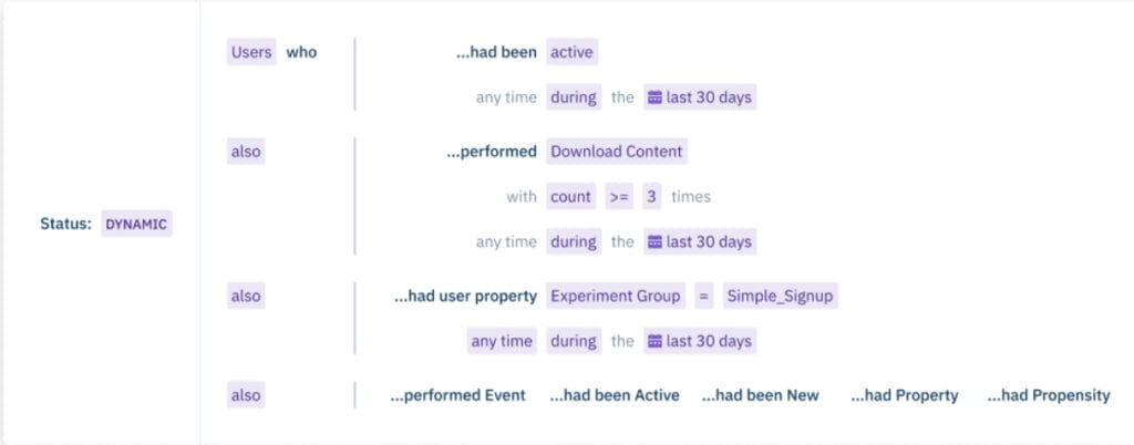
In the example below, you can see a cohort of people active in the past 30 days and have downloaded content at least 3 times in those 30 days. When you want to create a graph including these users, you don’t have to spend time fidgeting with filters but instead select this cohort and check its performance.

For our business 2nd phone line and CRM app client, Keap, we use Amplitude to help them identify key metrics to measure. While the data won’t tell you for sure what your problem is, it allows you to test where the problem might be located at.
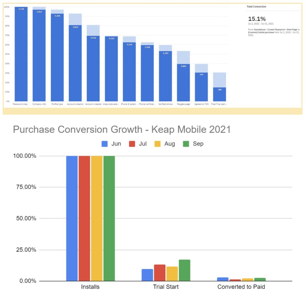
For example, in the two graphs below, you can see us checking if the users are engaging in the app by making or receiving calls. Amplitude not only shows you the current data, but also lets you set up a target goal to achieve. Even though we haven’t hit the established targets yet, we’ve since implemented changes that helped us move from the baseline numbers at the bottom of the graphs.

Optimizing the onboarding funnel
The onboarding process is very important for any app, as the user will then decide whether they will keep the app for a long term or delete it soon after. During the sign-up process, Keap asks users to identify whether they are planning to use the software for business or personal reasons. The company realized that spam senders and other undesirable users more frequently select “personal reasons” and Keap wanted a means to screen them out earlier in the sign-up process.
Due to this difference in users, it was beneficial to look at the onboarding flow using a funnel graph. In this case, the objective was to decrease the number of personal accounts that continued moving forward in the onboarding process (though typically the reverse is true—you want this number to go up!) But since we were trying to deter personal account formation, we used the following strategy: present the pricing screen earlier in the onboarding process.
With this approach—and by analyzing the data—we found that this worked. As seen below, the percentage of users in this category continues dropping, which was the goal.

Analytical tools are essential to understanding your users’ behaviour and ensuring their in-app experience is smooth and engaging. Amplitude is just one of many such tools. We highly suggest checking it out and seeing if it’s the right one for you!
If you’re unsure about what kind of tools you should be using in your tech stack, feel free to reach out to us for a consultation!
Related Articles
In today’s app economy, the “hard paywall or bounce” model is losing its edge. Users are savvier, competition [...]
Two major updates from Apple have landed — and if you work in app marketing, growth, user acquisition, [...]
The Digital Markets Act and the Digital Services Act are two major pieces of legislature brought forth from [...]


