5 App User Onboarding Tips to Increase Retention

Ask any mobile app industry expert: “what’s the most important metric to track for my app?” More than likely, you’ll get the same answer from most, if not all, of them: “retention.”
Especially when it comes to new apps, the reasons to maximize user retention are many, including viral user acquisition and monetization, among others. There are common strategies for increasing retention, but here, we want to talk about a critical stage in your app user retention, and that’s the onboarding process.
The average app loses 77% of its newly acquired users within the first 3 days after installing an app. This means that the first days are incredibly important, and the user’s very first interaction with the app could mean the difference between a loyal regular user and a churned user.
And this is where onboarding comes in.
The Role of App Onboarding
Hopefully, a new user has a fairly good idea of what to expect from your app from all of the app store elements – the description, screenshots, reviews, etc – or maybe from what they’ve heard from friends, family, or co-workers.
But, put yourself in the shoes of a user who has just installed your app:
I’m opening the app for the first time, is it obvious what I’m supposed to do? Do I have a clear sense of what this app will do for me and what to do next? Or are there more complex features that are unfamiliar?
If none of the above is self-explanatory for the user, then you know an onboarding for your app is necessary. If you don’t, you’re more than likely to end up with a frustrated deserter.
In order to avoid this undesirable scenario, you want to provide the Goldilocks app onboarding experience – one that isn’t too overwhelming, too scant, but is just right!

- User Onboarding Tip: Keep tutorials short and focused
- User Onboarding Tip: Keep user registration to the bare minimum
- User Onboarding Tip: Consider using an on-the-go interactive tour
- User Onboarding Tip: Incorporate timely visual hints or tips
- User Onboarding Tip: Avoid empty states or dead-end pages
What you’ll learn in this article
App User Onboarding Tips
#1 User Onboarding Tip: Keep tutorials short and focused
When you open a newly-installed app, one of the first things you’re likely to see is a tutorial or walkthrough about how to use this app. This makes sense, especially if there are features or functions the user needs to know to get the most out of the product. But, what you don’t want to do is kill an excited first-time user’s momentum by bombarding them with 7-8 screens explaining all of the app’s functions at once.
First off, that’s way too much information for one person to absorb at one time when all they want to do is get to the good stuff. That’s why you want to keep your static walkthrough short (max 5 screens) or – if you choose to do an animated one – to make it short and digestible.
Also, it’s actually not necessary to give the user every detail about your app upfront. You want to keep the tutorial focused so that it gives them just enough to get started. If there’s a feature that can be explained later – once the user is already engaged and happy with their download decision – you’re better off waiting until they’re ready.
Wavely, a job search app, uses a short 4-screen scrolling carousel that succinctly walks you through how to use the app upon first opening the app. It’s quick, concise and gives the user just enough information to know what they’re getting into and how to proceed without information overload.


#2 User Onboarding Tip: Keep user registration to the bare minimum
Another cumbersome step in the onboarding of many apps is a lengthy – or overly demanding – registration process. Again, put yourself in the user’s shoes and their thought process: “I’ve just downloaded this app and I’m curious to see what it’s really all about. But I haven’t even used it and they’re already asking me for a lot of personal information and even my credit card info. I don’t want to give them all of this – I don’t even know if I like the app yet!”
Sounds logical, right? In order to not leave a user with a bad first impression – that’s more than likely to result in a churn – try to delay asking for personal information until later, once they’ve had a bit of a chance to explore and become a fan. Let them warm up to you first before asking them to get too personal!
The LinkedIn app is a good example of a simple bare-minimum approach to initial registration.

#3 User Onboarding Tip: Consider using an on-the-go interactive tour
Interactive tours can be effective because they are user-guided. Once the user reaches a certain point in their journey, only then is a tutorial activated. It’s a learn-as-you-go approach that is an overall effective learning technique.
This method also solves the issue in tip #1 – instead of expecting users to absorb all the information at once, you give them just enough to keep moving along their experience seamlessly and organically.
#4 User Onboarding Tip: Incorporate timely visual hints or tips
This is especially useful for apps that have many interactive objects or an untraditional navigation method. Visual hints help users understand how to interact with the interface and get the best experience. But, again, you don’t want to bombard a new user with visual tips or make them come up too frequently. If you do, you’re taking your user on the path to cognitive overload, which usually does not lead to the desired outcome!
Instead, save informative visual hints for when they are needed. Not only are you providing the information in context – which is the best for the user to make sense of it – but you’re again making the experience seamless, enjoyable, and more personalized.
#5 User Onboarding Tip: Avoid empty states or dead-end pages
Empty states are places in the app experience where the user has no content yet – as they are just starting so haven’t yet had the chance. This could be many things, like a “Favorites” or “Challenges” section.
Instead of showing a blank page when clicked on, use this space to continue the onboarding and educate the user on how to use it and lead them to the desired action. Here you see two examples: one that is helpful – the user is given guidance on what to do by providing a brief explanation about what the section is for and an easy-access action item to get it started; the other is not so helpful – no how-to or further guidance is provided.
Helpful:

Not helpful:

Onboarding in a nutshell
To sum up, your app’s onboarding could turn an install into a raving review or a disappointing churn. In order to increase retention, button up your onboarding by following these guidelines:
- Keep it simple and focused – don’t overwhelm a new user with information overload
- Keep it relevant and in context – give tips when they’re needed
- Allow users to learn-as-they-go for a seamless experience
- Give a user a chance to experience your app before asking for too much personal info
- Use every blank space as a guidance and teaching opportunity

Related Articles

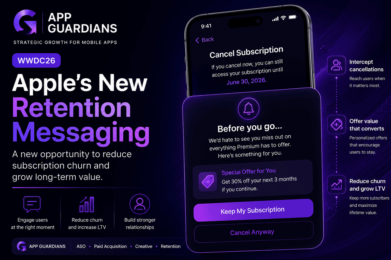
How Apple’s New Retention Messaging Could Help Reduce Subscription Churn When most app teams think about growth, they [...]
-
Summary of what WWDC26 Update Means for Mobile Growth Teams WWDC is often viewed as an event for [...]

In today’s app economy, the “hard paywall or bounce” model is losing its edge. Users are savvier, competition [...]