How to Conduct an ASO Audit for App Store Keywords & Creatives (Step-by Step Process)

This blog was written with our partner AppTweak and focuses on an ASO Audit conducted on the app Ella Verbs Spanish Conjugation in the US App Store.
This audit consists of two parts, “Conducting an App Store Keyword Audit” and “Conducting an App Store Creative Audit”, respectively carried out by AppTweak and App Growth Network. A video of the audit can be found here.
What you’ll learn in this article
Part 1: Conducting an App Store Keyword Audit1. Metadata Analysis
2. Current Keywords
3. Keyword Opportunities
4. Crafting new metadata
Part 2: Conducting an App Store Creative Audit
6. App Icon
7. App Screenshots
8. App Preview Video
Let’s get started with the first part: “Conducting an App Store Keyword Audit”.
Part 1: Conducting an App Store Keyword Audit

Metadata Analysis
Ella Verbs is a Spanish learning app focused on verbs and conjugations. It ranks in the Education category and has a great rating.
By just looking at the title, we can already uncover a few best practices and tips:
- With 30 characters, the title is taking full advantage of the available space
- Generic, yet descriptive keywords are included in both the title and subtitle
A first recommendation here could be to make the brand name of the app more obvious. Is the app name Ella or Ella Verbs or Ella Verbs Spanish Conjugation? That is not very clear at the moment.
When we have a closer look at the title and subtitle, we see that “Spanish” and “verbs” are repeated twice. Repeating keywords in the titles and subtitles is recommended on Google Play as the store’s algorithm takes density into account when determining ranking, but this is not the case on the App Store. Ella Verbs could therefore remove “Verbs” and “Spanish” from the title or subtitle and make room for more keyword opportunities.
Let’s now dive deeper and further analyze the specific keywords found in the title and subtitle.
Current Keywords

As part of a keyword audit, it is important to review the current choice of keywords and assess the performance. Here are a few elements to consider when auditing metadata:
- Search volume: Look for keywords that have the potential to drive traffic, meaning keywords that are searched by users on the app stores.
- Number of combinations: Can you make long-tail combinations with these keywords? What is the search volume of those keyword combinations? For instance, Ella Verbs targets “Spanish”, but is Spanish the only keyword with high volume, or is “Spanish conjugation” a good combination with a high volume as well? This is the sort of question you should ask when assessing keywords. Select the keywords that increase the scope or reach of your app in the search results.
- Current performance: Analyze the current performance of the keywords in your metadata to make sure you don’t remove any keyword which brings a lot of traffic or installs.
Ranking difficulty and strength: Lastly, check the difficulty of each keyword. With difficulty, we refer to the competitiveness of a keyword. It is very difficult to rank on a keyword that is highly competitive so you want to adjust the choice of the keywords you are targeting in your metadata to the strength of your app.

Let’s take a closer look at the keywords in Ella Verbs’ title. The keywords are very different in terms of volume with “Spanish” having a volume of 46, “verbs” of 17, and a volume of 5 for “conjugation”. Based on this data, a first tip could already be to remove “conjugation” from the title to make room for higher volume keywords. But before taking any action on singular keywords, it is important to analyze keyword combination opportunities.

The keyword “Spanish” for example makes many high volume combinations such as “learn Spanish” or “Spanish learning app”, while “verbs” and “conjugation” do not allow to make high volume keyword combinations. This doesn’t necessarily mean that “conjugation” and “verbs” should be removed from the metadata. These keywords could be useful in the subtitle or keyword field (unless there are better keyword opportunities), as they are very relevant for the app’s content and category. Updating a metadata field is all about prioritizing depending on the keyword opportunities available.
Keyword Opportunities
Finding new keyword opportunities is key to improving an app’s metadata and increasing visibility. There is more than one method to finding keyword opportunities starting by spying on competitors. Competitors are a vast resource for finding keywords opportunities. When reviewing competitors, consider market leaders, but also analyze apps with the same strength as yours for the most relevant insights.
The Top Charts in the Education category on the US App Store includes two language learning apps: Duolingo and Babbel. Let’s dig deeper and try to understand their keyword strategy to find new opportunities for Ella Verbs.

Duolingo and Babbel respectively target in their titles the generic keywords “language lessons” and “language learning”. The keyword “learning” is more interesting as it allows for more high volume keyword combinations such as “Spanish learning app”, “learning languages” or “learning Spanish”.
Crafting new metadata
The next step after gathering new keyword opportunities is to decide which ones to add to your metadata. Here are a few guidelines to help you in this process!
Title
- Pay attention to the brand: Ideally, the app name should come before any other keywords. Use a separation mark if necessary to distinguish your app name from generic keywords.
- Add priority keywords first: Add your top one or two priority keywords to your title to maximize visibility and installs.
Subtitle
- Focus on the benefits of your app: Select keywords that are relevant to your app’s content and functionality in order to increase visibility and conversion rates
- Choose relevant keywords with a high volume and low competition.
Keyword field
Add descriptive keywords with a high volume. Focus on keywords that make many keyword combinations.
Here is a short list of examples of keywords that Ella Verbs could target in the title or subtitle.

Keyword opportunities for Ella Verbs. Source: AppTweak
“Language learning”, “Spanish dictionary” and “Spanish vocabulary” are some general keywords that could be interesting for Ella Verbs.
As a reminder, the title is a stronger ranking indicator than other fields on iOS so it is essential to put the most relevant keywords there. The keywords in both subtitle and keyword field are estimated to have the same weight on Apple’s ranking algorithm. Those keywords can support conversion goals.
Keyword optimization is the first step on the path to improving app visibility. The second step is creative optimization.
Part 2: Conducting an App Store Creative Audit
App Store Graphics help to draw in the user onto your app store listing page, informing and enticing users to download your app. When looking to better optimize your app store graphics on iOS to support your app store optimization, it’s important to look at all the key visual elements of your App Store listing.
Let’s get into more detail about best practices on how to optimize the app icon, app screenshots, and app preview video to maximize App Store performance.
App Icon
The icon is typically the first thing users will see for an app store listing. When done right, having the ideal icon can greatly increase app conversion rate. Apps may increase their app page performance by 26% just by conducting app icon A/B testing.
App icon design best practices:
- Keep it simple
Too many ideas or elements can visually overwhelm the user, so it’s best to keep it clear and simple. Remember, the icon is often viewed in a relatively small space, and on a device screen, so smaller details can get lost. It’s important to use the space accordingly. - Make it unique
You want your icon to stand out from the rest and get attention, but it’s important to conduct competitor research to understand what your competitors are doing, and if they’re succeeding. - Incorporate learnings from the competition
As mentioned, you want to stand out—but you also want to see how in line your icon is with competitors in the category and take advantage of any learnings. Using Ella Verbs as an example, we took a look at the education category, specifically analyzing both DuoLingo and Babbel’s icon, as per AppTweak’s research.

Both competitors use bright, eye-catching colors, and utilize the full width of the icon screen. We also analyzed other competitors in the space and found that they incorporate the colors of the Spanish flag to indicate their app is specific to the Spanish language. While it may not be necessary to include the Spanish flag in the icon, it might be worth testing if this helps with conversions.

The conclusion from this analysis would be to A/B test different variations of Ella Verbs’ elephant icon with the following criteria:
- Filling the white space (Using a background colour)
- Enlarging the icon
- Test the expressions of the icon
- Test integrating the colours of the Spanish flag
While creative can be interpreted as subjective, we can use data to better support our hypotheses and a/b test to improve our conversion rates.
App Screenshots
When optimizing app store screenshots, remember that they too should be eye-catching but also need to deliver important information to the user about your app. For screenshots, A/B testing can boost app page performance by up to 20%.
The app store can have up to 10 screenshots, but ASO experts advise that the first three are the most important, with six being the optimal number of screenshots to have. To optimize your screenshots, we recommend using high-volume keywords in the first 3 screens to quickly communicate the app’s relevance to users. Make sure your first screenshots also showcase your best features, as they will be displayed in the search results on the App Store.
App Store screenshots should:
- Be legible (font size matters)
- Be optimized for different device types
- Highlight key features
- Use high-volume keywords (show relevance in user searches)
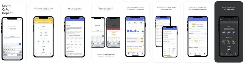
Based on these best practices, for Ella Verb’s screens we would make the following recommendation:
- Increase the font size on screens 2 through 8, so the font is a bit more legible to users
- Change “Learn” to “Learn Spanish” on the first screenshot to better educate the user that the app is specifically for the Spanish language. Based on AppTweak’s research “Learn Spanish” and “Spanish Learning App” were both flagged as high-ranking keywords
- Incorporate ideas from top competitors
- Use pop-outs to emphasize certain features
- Highlight the number of subscribers to communicate app’s legitimacy
- Leverage social proof by including press testimonials and awards

App Preview Video
Preview videos are an effective way to showcase the main features of your app, and can provide the users with a better understanding of how to use your app. App preview video A/B testing can boost app page performance by up to 16%. But with only 30 seconds, it’s important to communicate the most important features in a timely manner.
Here are app preview video best practices to keep in mind:
- Reveal the app’s most compelling features at the very beginning
Even though you technically have 30 seconds worth of information to share with the viewer, the average video watch time is only 4 to 6.5 seconds. - Showcase the app’s best features
Users will watch your app video because they want to make an informed decision about whether or not they want to download your app. Showcase the app’s main benefits without overwhelming them with every feature. - Make the app video interesting and on-brand
Besides being informative, videos need to be visually appealing. The colors, effects, transitions all play a role in making the app preview interesting to watch and communicate a lot about your app’s branding. - Don’t forget about your Poster Frame
The Poster Frame is the very first image displayed before the app preview video autoplays. Because the App Store video is placed before the app store screenshots, it’s an important piece of real estate which should be taken advantage of in order to make a first impression.
For Ella Vergs, we would recommend changing the poster frame so that it contains high-volume keywords and an image that represents the app’s core features.

And there you have it! An in-depth, detailed view of what it takes to conduct a thorough app audit. As you can see, keywords and creatives work hand in hand to boost an app listing performance on the App Store, so make sure you’re optimizing both for maximum conversion rate potential.
If you enjoyed today’s app audit session and would like to have your app audited, please sign up for our newsletter and stay connected to our channels for future announcements!

Related Articles

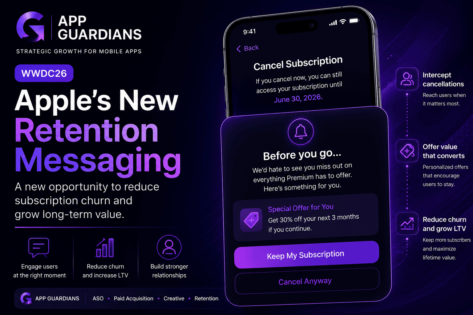
How Apple’s New Retention Messaging Could Help Reduce Subscription Churn When most app teams think about growth, they [...]
-
Summary of what WWDC26 Update Means for Mobile Growth Teams WWDC is often viewed as an event for [...]

In today’s app economy, the “hard paywall or bounce” model is losing its edge. Users are savvier, competition [...]