How to Build Efficient App Data Reports
Did you know that, on average, marketers use more than 12 tools every day to manage their marketing and product data? Combining learnings and extracting insights from so many sources is not only chaotic but incredibly time-consuming.
In this post, we’ll be summarizing an MGS Global Virtual Conference 1.0 session led by our Sr. Growth Manager, Michaela, and Head of Analytics, Gopika, to learn how AGN integrated the most common tools into a single user-friendly dashboard to make reporting faster and more efficient.
Let’s begin.
- Tracks Most Important App Metrics
- Use These Tools to Track App Metrics
- What a Unified Dashboard – that saves 11 hours per week – looks like
- How to Build a Data Reporting Dashboard
What you’ll learn in this article
Every app company – no matter how large or small – consists of 3 different departments, each with their own job functions.
1. Product
The area is all about the product itself – its design, usability, and the customer journey which includes engagement, retention, and monetization.
2. Marketing
This department focuses on building the right user personas, the creative design of campaigns and using the right channels to attracts the right users – like organic (ASO) and paid channels (ASA, Facebook Ads, Ad Networks)
3. Business
This is where management comes in, and their role is to keep track of the bottom line monitoring cost and revenue.
With this in mind, let’s delve deeper into which metrics are the most essential, how to track them, and how to do it better!
Tracks Most Important App Metrics
While all aspects of an app product are interrelated and share some common goals, each one has a set of metrics that are particularly relevant to that area. The table below neatly outlines the most important metrics by the 3 departments: Marketing, Product and Business.
Top Metrics You Should Track

Use These Tools to Track App Metrics
Every experienced app marketer works with mobile app tracking tools to measure these metrics. Among those tools for the marketing department, usually, at least 1 includes an App Store Optimization (ASO) tool and/or 3 Paid User Acquisition tracking tools.
For product, managers use at least 1 Attribution tool and at least 3 Analytics tools.
Meanwhile, the business department uses additional tools to get the most insight into the app’s economic situation by using financial reports.
Take a look at the table below for a list of available tools you can use to track each category of an app’s top metrics.
Tools to Measure These Metrics

With 11 tools, on average, to monitor and track every week – and assuming 1 hour on each of them per week – we’re talking 11 hours of analysis per week!
What a Unified Dashboard – that saves 11 hours per week – looks like
The reporting dashboard that we’ve created is divided into 10 reports – with the first one being the overview report.
The Overview:
Below you see the Overview screen, which shows an executive summary view of everything you want to know on one screen. It shows over costs, marketing KPIs, product KPIs and product funnels, plus budget and CPI goals.
Dashboard Overview

Campaign Performance Report:
These user-friendly reports allow you to see every aspect of your marketing campaigns. For example, you can dig deeper into Facebook Ads performance with an at-a-glance view of Acquisition (number of installs), Costs (spend, CPA for registration and purchase) and Conversion (CVR for registration, free trial and purchase).
Plus you can see CPI daily performance and see which specific aspect of the campaign accounted for impressions, clicks and installs – all in colorful, easy-to-read charts and graphs. This report is a clear indicator of campaigns that are winners and those that aren’t performing well.

Detailed Performance Report:
To drill down even further, you can also see specific aspects of your paid marketing campaign. The example below shows a report that displays keyword performance in Apple Search Ads. With this information, you can further optimize by tracking the keywords that are performing best and leverage this information for ASO as well.
Apple Search Ads Keywords Report

Business Reports:
Business KPI reports are also generated which show Lifetime Value (LTV) and Customer Acquisition Cost (CAC). Remember here that, in order for the marketing spend to be on track, the LTV must be lower that the CAC.
Custom Report:
Depending on the type of mobile app product, custom reports can also be created to show data that are relevant for tracking that product’s performance. The example below shows a custom report that was built for a dating app, showing the data based on regions and the female user ratio.
Customize the Report to Your Specific needs

How to Build a Data Reporting Dashboard
Extract data using API calls and CSV uploads
1) Extract data (API Call & CSV Upload)

Data processing with Google Sheets and Google App scripts
2) Data Processing

Visualize data using Google Data Studio
3) Data Visualization

Key Takeaways
Know the most important app metrics in each area that are indicators of a mobile app’s success. These areas are Marketing, Product and Business.
Measure the metrics in each category with the right tools. There are many out there, so be sure to select the ones that best serve your type of app. Don’t be surprised if you have over 10 tools monitoring data – most marketers do!
A unified dashboard can save you over 10 hours of report analysis per week. Our dashboard integrates the data of all measurement tools into one and drills down to create 10 useful reports.
Just think about what you could do with an extra 10 hours per week! If you’d like to know more about our data reporting dashboard and conducting effective data analysis, we’d be happy to show you a free demo.

Related Articles

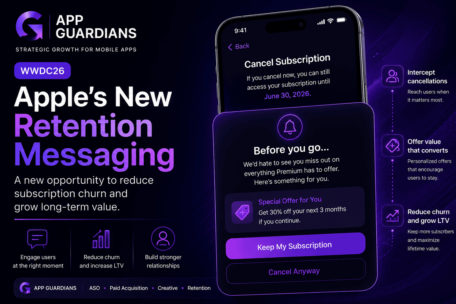
How Apple’s New Retention Messaging Could Help Reduce Subscription Churn When most app teams think about growth, they [...]
-
Summary of what WWDC26 Update Means for Mobile Growth Teams WWDC is often viewed as an event for [...]

In today’s app economy, the “hard paywall or bounce” model is losing its edge. Users are savvier, competition [...]