10 App Store Screenshots Best Practices That Boost Conversion Rates

Having amazing app store screenshots plays a critical role in on-page App Store Optimization (ASO). For one, optimizing screenshots in the Apple App Store and Google App Store can significantly increase your conversion rates.
What is a conversion rate? In general terms, it’s the percentage of users who have performed a desired action. In this case, it could be the percentage of users that download your app. Creating stand-out screenshots helps make this number higher – which is a good thing! Plus, it helps with organic growth – another good thing!
Here are our top 10 App Store screenshots best practices for creating screenshots that will that will optimize conversion:
1. Think about the app store screenshot differences between Apple Store and Google Play
While searching in the Apple App Store, on iOS 12, you immediately see almost two screenshots on your screen. For the first screenshot, there’s the option of having an auto-play video app preview.
In the Play Store there is a Feature Graphic on the top which can be a video or an image. Users must click on the play button to view the video. You then you have to scroll to see 3 screenshots.
So for Apple apps, you want to make the first two screenshots really count. For Android apps, you’ll need to focus on an exemplary feature graphic to entice people to scroll down and see more.
2. Demonstrate the key message in the first app store screenshot
People only stay on the app store page for 7 seconds before they decide whether they download or ditch. This means you have a very limited time to grab people’s attention and persuade them to install your app. By clearly communicating your app’s key message in the first screenshot, users are more likely to stop and take your app offering into consideration.

3. Keep the app screenshots simple and readable
Keep in mind that the screenshots will be displayed on small displays of mobile devices. Test on multiple devices and keep the text big enough so it is easy to read even without clicking on it.
Use simple backgrounds and concise text – having too much information in the screenshots can be overwhelming for the visitors and decreases their willingness to install the app (i.e., lower conversion rates).
Tinder’s screenshots on the Google Play store illustrate this practice using large text, simple words and being straight to the point.
4. Connect the screenshots with a story
Instead of stand-alone screenshots that demonstrate the features of the app, you can connect those screenshots by creating a storyline between them.
Also, the first 1-2 screenshots should show the most important message about the app either in a video, or in a landscape or a split mode.
For the Shazam app, you’ll see that the first 1-2 screenshot are “split” while demonstrating the main message (Shazam):

Foodora’s first screenshot is different from the rest, but is connected by the background’s design:

Linking the screenshots in the background can also increase people’s curiosity to scroll to the following images which gives you more “space to sell your story.”
While having “split” screenshots was very popular in these past years, they’re becoming less popular because they require more advanced design skills.
5. Use high resolution images
If you can, invest into custom images which represent your app or game. If you don’t have the resources for professional images, using shots of the app’s UI is sufficient.
Do not use stock images. Using stock images can make the app look unprofessional and unappealing.
6. Edit the status bar before publishing each app screenshot
A sure app download killer is not properly editing your screenshots! Whether in the iOS app store or Google Play store, make sure to edit the unnecessary icons from the screenshots. Be sure to edit out:
- The service provider
- Full wifi icon
- Full battery icon
- Bluetooth and other icons disabled
- Time – Apple recommends 9:41 or 12:01 (wonder why? – read here)
Pro tip: If you have a Mac, you can use a QuickTime Player to capture the UI and the status bar will be edited automatically.
See an example of a screenshot below – notice the battery percentage, time, and wifi signal that haven’t been edited:

7. Focus on value, not features
Always convey the unique value proposition that your app offers to the users. How will the users feel when they use the app? Does the app have certain steps a user has to go through? Guide them through to show them the look and feel of the app even before downloading it.
While it can be a good idea to show the user experience, be careful because Apple has strict App Store screenshot policies and can reject them if you don’t use the UX images in the approved way.

8. Localize your graphics of your screenshots
If your app or game is available in multiple languages and countries, localize the graphics of your screenshots to the local language. Localizing them can remove a language barrier and make it easier for users to understand the features of the app.


9. Use at least 5 screenshots for iOS and Google Play
The app store pages are the place where you persuade the visitors to become users. Apple and Google give you limited space for your metadata and screenshots for your ASO (max. 10 screenshots for an apple device, max. 8 for an Android device). Be sure to maximize this space effectively and thoughtfully – you never know what can trigger the visitor’s attention.
10. Visually acknowledge awards, testimonials and exclusivity in a screenshot
Your screenshots can showcase selling points other than just your app’s features and UI.
If your app has already been awarded, featured by Apple, Google, or a famous big publisher, do not hesitate to mention it in the screenshots. Doing this will increase the credibility of your app and people will be more likely to download it.
If you do not have this coverage but have another big achievement – e.g., 1M downloads or if you app has an “exclusivity” feeling – include those in the first screenshot.

These 10 tips are only a high-level overview of key points and app store screenshot best practices you should take into account when developing creatives. Would like to learn more about ways to improve your creatives in app stores? Contact us for a free app evaluation!

Related Articles

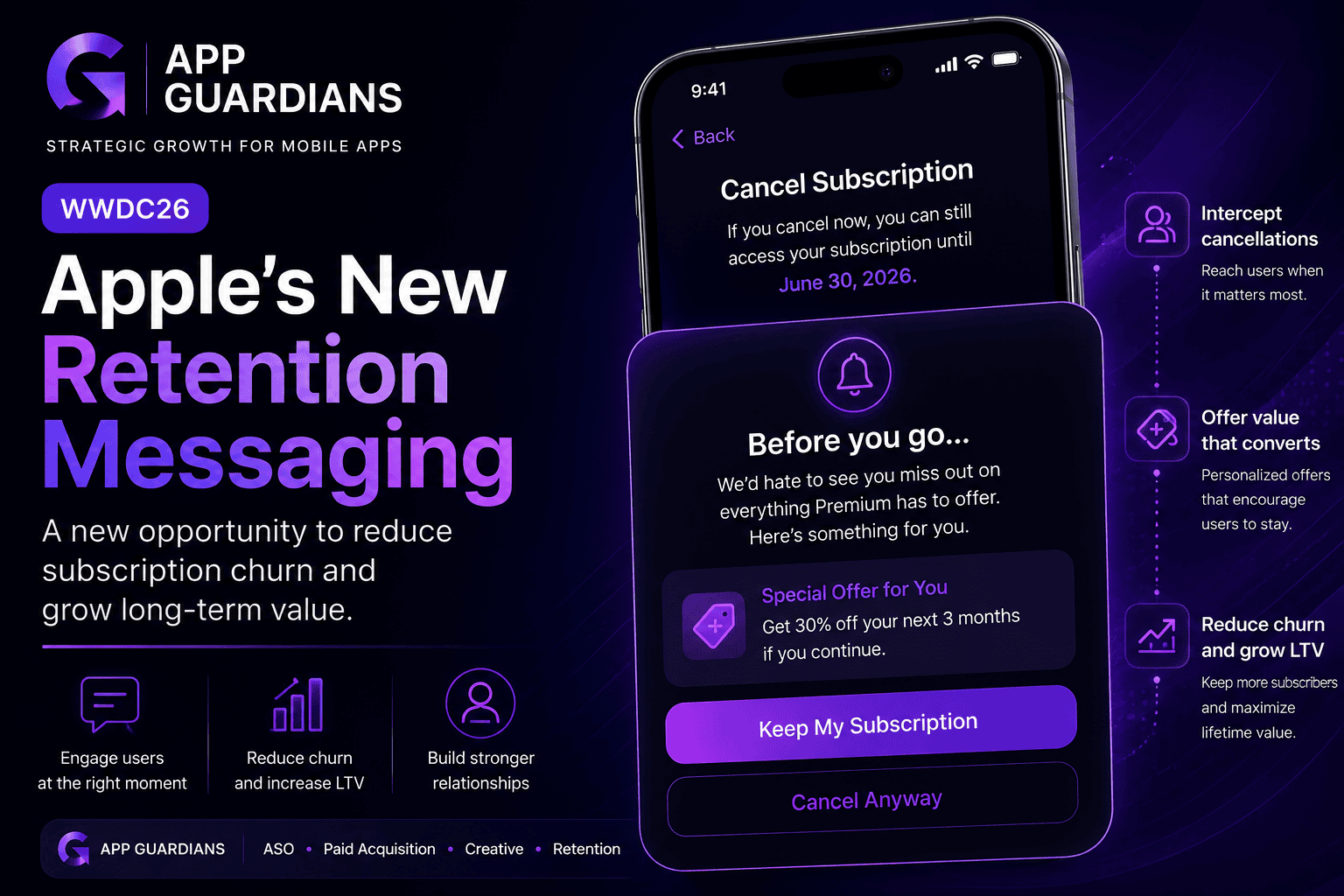
How Apple’s New Retention Messaging Could Help Reduce Subscription Churn When most app teams think about growth, they [...]
-
Summary of what WWDC26 Update Means for Mobile Growth Teams WWDC is often viewed as an event for [...]

In today’s app economy, the “hard paywall or bounce” model is losing its edge. Users are savvier, competition [...]