How To Create App Screenshots That Boost Conversion (2020)
Consider this: not every app store visitor who comes across your listing will read your app’s description, but 100% of them will be exposed to your first-impression screenshot.
That’s why app screenshots play such a pivotal role in on-page App Store Optimization (ASO). Optimizing screenshots in the App Store and Google Play store has been shown to boost conversions rates by 18% on average. The more you can increase CVR, the better it is for your organic growth.
Here are our top tips for how to create app store screenshots that will stand out and optimize conversion:
- The differences between Google Play and Apple App screenshots
- Use at least 5 screenshots for App Store & Google Play
- Prioritize the first 1-2 app store screenshots
- Use app screenshots colors & style that communicate the app’s ‘personality’
- Create concise, readable app store screenshots captions
- Connect app store screenshots with a story
- Use high-resolution images for screenshots
- Localize your app screenshots graphics
- Feature awards, testimonials or other points of exclusivity in your app screenshots
Here are our top tips for how to create app store screenshots that will stand out and optimize conversion:
1. Mind the differences between Google Play and Apple App screenshots + app screenshot specs

One of the differences between iOS App Store and Android Google Play is how things appear on the search results page for a category. In the App Store, a search displays three screenshots on your screen with the option of having the first screenshot be an auto-play video app preview. For Google Play, screenshots are not visible in search results. Users only see the screenshots after they’ve clicked through to the product page. But they still play a pivotal role in converting app page visits into installs.
App Store: Google Play:


For the app store listing page, almost two (more like 1 ½) screenshots are displayed in the Apple App Store. In the Google Play store, you see almost three full screenshots.
App Store: Google Play:


App Store app screenshot requirements:
| 1242 x 2688 pixels (portrait) 2688 x 1242 pixels (landscape) |
| 1125 x 2436 (portrait) 2436 x 1125 (landscape) |
| 1242 x 2208 (portrait) 2208 x 1242 (landscape) |
| 750 x 1334 (portrait) 1334 x 750 (landscape) |
| 640 x 1096 pixels (portrait w/o status bar)
640 x 1136 pixels (portrait w/ status bar) 1136 x 600 pixels (landscape w/o status bar) 1136 x 640 pixels (landscape with status bar) |
| 640 x 920 pixels (portrait w/o status bar)
640 x 960 pixels (portrait w/ status bar) 960 x 600 pixels (landscape w/o status bar) 960 x 640 pixels (landscape w/ status bar)
|
Google Play app screenshot requirements:
Must have at least two screenshots that meet the following requirements:
- JPEG or 24-bit PNG (no alpha)
- Minimum dimension: 320px
- Maximum dimension: 3840px
- The maximum dimension of your screenshot can’t be more than twice as long as the minimum dimension.
You can also add 15 to 30 seconds videos – directly embedded from YouTube – that will always open full-screen in landscape and will be displayed
2. Use at least 5 screenshots for App Store & Google Play
App store pages are extremely valuable real estate for your app. Even though Google Play enforces a 2-screenshot minimum, you want to capitalize on as much of your app store real estate allowance as possible.
The app store pages are the place where you persuade visitors to become users. Apple and Google give you limited space for your metadata and screenshots for your ASO (max. 10 screenshots for an apple device, max. 8 for an Android device) – maximize this space effectively and thoughtfully – you never know what can trigger the visitor’s attention.
3. Prioritize the first 1-2 app store screenshots
People spend an average of 7 seconds on an app store page before deciding whether to download the app or move on. So, you have a small window of opportunity to grab a prospect’s attention and persuade them to install your app. This makes your first app store screenshot particularly important. This is where you must clearly and concisely communicate your app’s key message so that users will stop and take your app offering into consideration.

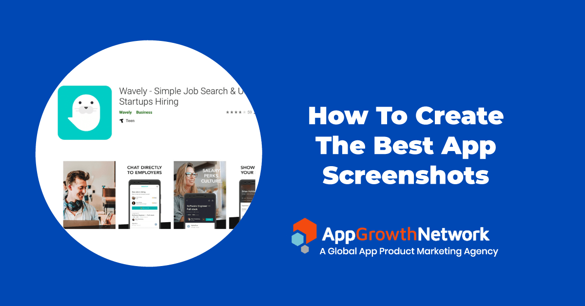
(Job search app, Wavely, screenshots demonstrating its key messages)
4. Use app screenshots colors & style that communicate the app’s ‘personality’
If your app is calming, professional or playful, the screenshots should reflect it. For example, a playful app might incorporate vibrant custom colors in every screenshot while a calming app could use soft, muted colors with a minimalistic layout.
Here are some helpful ASO tips when selecting the colors to use in screenshots layouts:
- colors should match the message of your screenshots
- colors used in the design should convey what it’s like to use it the app
- keep color palette focused and don’t turn your screenshots into a confusing mix off too many different colors
- colors should reflect the localization your product age and resonate with your target audience

Image source
5. Create concise, readable app store screenshots captions

Keep in mind that the screenshots are typically viewed on mobile devices that have relatively small display space. Be sure to keep the text big enough so it is easy to read even without clicking on it and to test on multiple devices.
Use simple backgrounds and concise text – having too much information in the screenshots can be overwhelming for the visitors and decreases their willingness to install the app (i.e., lower conversion rates).
6. Connect app store screenshots with a story
Instead of stand-alone screenshots that demonstrate the features of the app, you could try to connect those screenshots by creating a storyline between them.
The first 1-2 screenshots should communicate the most important message about the app either in a video, in landscape or in a split mode.
Here we see an example from Down Dog using a visually attractive technique of having the screenshots “split” to create a smooth flow of the app’s story while clearly communicating what the app is about:

Whereas the first screenshot for Yoga for Beginners is different from the rest, but the screenshots connected by the background’s design.

Linking the screenshots in the background can also increase people’s curiosity to scroll to the following images, giving you more space to sell your story.
7. Use high-resolution images for screenshots
If possible, invest in creating custom images that best represent your app or game. If you don’t have the resources for professional images, using the best shots of the app’s UI is sufficient. Avoid using stock images, as this can give an unprofessional and unappealing impression of your app and hurt conversion rate.
8. Localize your app screenshots graphics
If your app or game is available in multiple countries and languages, be sure to localize your screenshots graphics to the local language. Doing so will remove the language barrier and make it easier for users to understand the features of the app.

(Screenshots of Starbucks localizing their app in accordance with the country – France, Canada, and Taiwan respectively)
9. Feature awards, testimonials or other points of exclusivity in your app screenshots
App screenshots provide the perfect opportunity to showcase selling points other than just your app’s features and UI.
If your app has received an award or been featured by Apple or Google, don’t hesitate to mention it in the screenshots. This will only benefit your conversion rate by increasing the credibility of your app and enticing more to download it.
If you don’t have award accolades but have achieved another major milestone – e.g., 1M downloads or if your app has an “exclusivity” feeling – include those in the first screenshot.

(Screenshots from Breethe meditation/sleep app)
These tips are only a high-level overview of key points you should take into account when creating screenshots. Would like to learn more about the ways how to improve your creatives in app stores? Contact us!
Related Articles
In today’s app economy, the “hard paywall or bounce” model is losing its edge. Users are savvier, competition [...]
Two major updates from Apple have landed — and if you work in app marketing, growth, user acquisition, [...]
The Digital Markets Act and the Digital Services Act are two major pieces of legislature brought forth from [...]


