How To Make Your App Icon Stand Out – App Pre-launch Series Part 5
So far in our App Pre-launch Blog Series, we’ve talked about several ideation phase elements and some building phase elements – like how to master text-based metadata. Over the next few articles of the series, we’re going to talk about all the visual elements of your metadata – your creatives!
In this article, we’ll focus on the first essential creative: your app icon.
Before getting into app icon design tips and best practices, it’s important to understand what app icons are and the purpose they serve. If you think your app icon can be an afterthought – you may want to think again. Here’s why:
Consider your icon to be your very first branding component – the visual representation of your app’s core. With 1.8 million apps in the Apple Store and 2.47 million in Google Play, users have plenty of apps to choose from.
Your icon is the first impression they’ll get of your app and what it’s like, and the first thing they’ll see before deciding to download – before even your name, description or screenshots. Having a “just ok” icon versus having a stand-out icon could mean the difference between getting a scrolling user to stop on your app, find out more and possibly lead to a conversion – or having them whizz on by and missing out on an opportunity completely.
So, yes, having the right icon is that important!
Now, let’s talk app icon design and best practices…
1. Less is more
Remember that your app icon will be seen mostly on smartphones – which means they’re pretty small! In order to connect instantly to a prospect, they must be able to see the imagery clearly. An icon that is complicated or tries to pack in too much won’t catch the eye and will surely get skipped over.
Clean and minimalist is the way to go. Not convinced? Take a look at these examples of paid apps that top the charts to see what we mean:

2. Make your app icon catchy
The only way to grab people’s attention and be memorable is to stand out from the crowd – in a good way. The design should be interesting while being relevant to the solution your app offers.
Do your research. Are the competitors in your category mainly using blue in their icon design? Then try using green in yours. Are most of your competitors using a checkmark? Then make sure you don’t use a checkmark!
Having a simple design doesn’t mean it has to be boring. The examples above illustrate this point perfectly. The design of each is so well thought out and concise artistically, nothing needs to be explained.
The AutoSleep Tracker icon is just a light circle against a dark background – it doesn’t get much simpler than that! But it catches your eye, doesn’t it? Because of the hues chosen- the pale yellow of the circle that creates a “halo” effect around the dark background that progressively gets darker – and with its slightly off-center positioning, there’s no question that it’s the moon in the night sky. The fact that nighttime/sleep is the essence of the app is communicated immediately.
3) Match icon design to the app’s style
While you want your app’s icon design to be eye-catching, you also want to make sure that its design is smart. What the icon visually communicates should make sense and create a bridge to the app itself – which means staying consistent across all styling elements. Text, image style and color palette should create a steady experience across the board.
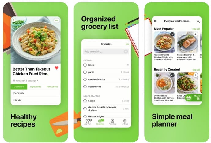
Mealime, a meal planning and recipes app shown below, is a good example of consistent design. Their icon is simple and clean with a bright lime-green and white color palette.
When you look at the screenshots, you get the same experience. The same bright green is used in select text and buttons as shown in the screenshots – the app design is also clean and simple – making the icon an accurate representation of what the user will experience with the app itself.
Logo:

Screenshots:

4) Ensure app icon’s scalability
An important thing to remember is that your icon will appear in different sizes and at different resolutions. Make sure that the icon is equally effective in a variety of sizes – is anything lost if it’s used smaller or bigger? Does it “read” the same way regardless of resolution and platform use?
Test the preview icon in all scenarios – from how it will look in the app stores, in search ads, in the settings panel, etc.
5) Test app icon against a variety of backgrounds
Your app icon will be seen against different wallpaper background screens – which is a variable you cannot control. Using contrasting colors in the icon – light on dark or vice versa – is the most common and effective way to ensure that the icon doesn’t get lost, even against the busiest of backgrounds.
The best thing to do is perform your own tests to make sure that the design and colors are such that the icon will “pop” against any kind of background – dark or light, bright, patterned, etc.
5) Perform icon tests
You’ve tweaked, adjusted and fine-tuned your app icon. You think it’s perfect. But how can you be sure it will yield the best results? The best answer: test it.
Don’t settle on your first draft. Have your hero design, but create multiple versions of it – adjust one or more of the colors, change the font style, rearrange the design or add a character. Run the various versions and see which one gets the highest conversion rate.
Take our self-improvement app client, HiMoment, as an example. They started off with a text version of their icon, but knowing that characters establish a quicker connection and perform better in the wellness category, we created an icon character to test. After testing the new character, HiMoment saw a 26.6% increase in install performance!
6) Adapt Your Icon for Seasonal Celebrations
You’ve probably noticed by now that Google makes some brilliant and creative tweaks to their logo throughout the course of the year – like replacing the two o’s of Google with pumpkins during the Halloween season and adding traditional Christmas accents during the holiday season.


Not only does it keep the brand fresh and relevant, but it captures attention. Try seasonalizing your app icon and see what impact it has. It can be something subtle, like adding a small Santa hat during the holidays or changing your icon to rainbow colors for Pride month. There’s a reason why giants like Google, Facebook and Twitter take this approach, so it’s definitely worth a shot!
Even after you’ve designed, created and tested THE perfect app icon – you’re not done yet! There are other visual elements that you need to get right – like your screenshots. Lucky for you, our next article in the App Pre-launch Blog Series will tell you all about it!
If you’d like a free one-stop resource to all of our mobile app launch tips right now, download our “How To Launch An App” e-book here!
Related Articles
In today’s app economy, the “hard paywall or bounce” model is losing its edge. Users are savvier, competition [...]
Two major updates from Apple have landed — and if you work in app marketing, growth, user acquisition, [...]
The Digital Markets Act and the Digital Services Act are two major pieces of legislature brought forth from [...]


